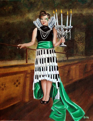
If you're from my generation, I just bet you hear the Eagles singing...
"On a dark desert highway,
Cool wind in my hair,
Warm smell of colitas,
Rising up through the air..."
She was my "Hotel California" girl from the beginning - although she's probably too young to have any idea what that's all about.
This portrait is different from my norm, but what fun to do something so different! The young man who asked me to do it, gave me artistic license with the photograph to do what I wanted. Yea! I knew that it was her in all her elegance and mystery that was what I wanted to capture. She had to be confident and regal to pull off that stunning dress.
It was a pretty complicated painting, so there are so many details that I want to write about! It was a series of struggles that I had to figure out!
- The background - How could I diminish everything that was going on - windows, tapestries, columns, curtains - that just weren't important. I alluded to those things but fuzzed them out of focus. Just to keep harmony, I used the green, reddish-brown, gold, and purple (that I shaded with) from the foreground in the background.
- The floor - How could I show the beauty of the hardwood without bringing attention to it? I simply painted it perfectly then brushed it (almost) out.
- The counter or pew or whatever that thing was - How could I use it to show the depth of the space without making it interesting enough to look at? I did the same thing. I painted it perfectly then blotted it, getting fuzzier and darker as it went back.
- The rail - Well, that wasn't really how that looked, but I had to have something substantial so that her hand wouldn't be just hanging in space. It ended up helping with the depth anyway.
- The skirt - Wow! It took a while to figure out what it was. Scales? tiles? I decided they were like piano keys. I had to redo them after the first time. I realized that every one was exactly alike, perfectly in rows - boring and without life. You can't see it, but I put the greens and purples (that I shaded the green with) to add life to the black of the keys. I don't know how, but it worked.
- The sash - I would have said that green is the color I'm most comfortable using; however, I learned that the greens of landscapes and leaves and backgrounds is not the same as that on a satin cloth. There are three different tries underneath what you see in the final painting. I tried to highlight with yellows and to shade with dark green - neither was right. Eventually, white for the highlights and purple for the shades worked.
- The black shirt - I think that must have been some kind of suede or velvet. It had some neat sparkles... I gave up on those... Used my "artistic license" to decide they weren't important. (That way I didn't have to admit, I just couldn't get it right.)
- Her arms and hands - Ugh... just don't zoom in. I finally had to tell myself to let it go... I did consider putting another green sash over them! Seriously, try not to look too closely.
- Jewelry, candelabra, and collar-thingy - I got to use silver! I've rarely had the opportunity to open that tube. In the end, I had to cover most of it with white, black, and blue. But, I know that the silver is under there!
- Flames - I think they might be too yellow. I need to decide that and decide if I need to go back and mute them a little.
- Her face - I put off doing the face until the very end. It was so small, I couldn't imagine I'd ever get it right. To my surprise, it came together quite nicely. I don't know if it's the "spittin' image" of the young lady, but I'm not sure that matters in the grand scheme of the whole here. Once I could sit back and say, "...such a lovely face, such a lovely face..." it was time to add the green tattoos. That was hard to do! I felt like the time I had to put mud on the side of the beautiful red truck on "She Said YES!" (Go have a look at that one.) But, the beauty of those is that they detracted from any mistakes I might have made on her face.
- Her hair - It was fine. Then at the last minute - after I'd already signed my name, I went back and put some green in her hair! Yeah! (That will teach someone to give me freedom to use that artistic license!
- The name - Well, if you totally got it on the first paragraph, then you'll get it on the title. If not, then the name's just as mysterious to you as the lady herself.
[SOLD]


I think you accomplished well what you intended with the floor, background and rail. In fact, her holding the rail gives stability and balance to her load. I love the way you captured the satin and the portraiture is quite stunning. Great job! I'm sure your client is extremely satisfied with it and you had a nice diversion in subject matter....can't get any better:)
ReplyDeleteThis really is culex with lots of,colors and different textures. Really helps to break it down and attack each area. I agree with Cheri ha fabric and wood is spot on. Nice work.
ReplyDeleteThanks!
DeleteThis comment has been removed by the author.
ReplyDelete